I recently saw a feature in a magazine about an item so intriguing that I was compelled to investigate the retailer’s website. I left my comfy reading chair to go to the computer with the intention of making a purchase. When I got to the website, I found that I could barely make out the product description because of the font and color they used. The print was small and the colors—gray on gray—did not provide contrast for me to read what I wanted to learn. So frustrating!
This has happened to me before, and maybe it has happened to you. Occasionally I have resorted to cutting and pasting to a blank document, where I can manipulate the text so I can read it. But this time, I was miffed, so I emailed the webmaster:
I came to your website intending to buy a product I saw in a magazine but found I was unable to read the light gray text. Please let your design team know that not everyone has the vision of a 20-year-old. It is very hard to read without enough contrast and the text is too small. If you only want to sell your product to young people, please don’t change a thing.
Today, they responded:
Hello Ms. Evans,
Thanks for your email. (Our product) is perfect for everyone and we would never want to exclude anyone from the possibility of enjoying its benefits. We’re sorry to hear of your difficulty with the text on our website and will take your comments into consideration for future redesign.
Best regards,
Autumn
Well, Autumn, perhaps I didn’t make myself clear, because your response to my request for contrast and a bigger font was written in light gray, 10-point Helvetica. In other words, I couldn’t read it.
Lest you think I am being unreasonable by wanting graphic designers and marketing people to cater to my vision challenges, I reached out to a friend of mine who’s an Internet expert. He confirmed that this is really a simple fix—just add the “AAA“ button, and readers can increase the text size to what works for them. My IT friend says even a very basic website has this capacity. I’m happy to say the SCF website features this option
So, attention, folks selling ideas, services and products: it isn’t hard to make your website easy to read for all of your potential customers. And should you decide that’s not right for your site, I don’t think that I am the one with the vision problem.

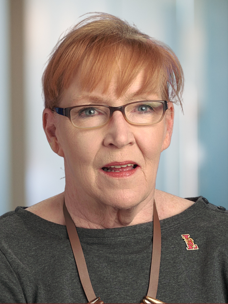
Pepper Evans works as an independent-living consultant, helping older adults age in place. She is the empty-nest mother of two adult daughters and has extensive personal and professional experience as a caregiver. She has worked as a researcher and editor for authors and filmmakers. She also puts her time and resources to use in the nonprofit sector and serves on the Board of Education in Lawrence Township, NJ.


